Rethinking Toolbars in Visual Studio (or any IDE)
 Count the Arrows on the Toolbar
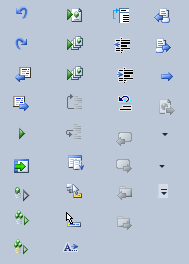
Toolbars are kind of ridiculous. You start off with row after row of cryptic icons which mean almost nothing to you. Even after years of using a program you've probably only ever used half of them, and have no clear idea what the other half do, and probably don't need them anyway. Not to mention that it's so hard to come up with meaningful icons that most of them end up just being an arrow of some kind.
To (supposedly) overcome these kinds of problems Microsoft invented the 'ribbon,' but it hasn't made its way into Visual Studio yet. I think a different solution could be better:
Toolbars could work the same way as the taskbar does in Windows 7:
It would start out empty.
Clean. Beautiful. This is far preferable to today's approach: starting out full of clutter.
Thereafter, when you run a command (by selecting it from a menu option, for example), it would show up on the toolbar (in the same way that running an application in Windows 7 show up on the taskbar.
After that you would be able to right click it and choose to 'pin it' in place, so it stays.
There would need to be some difference in the behaviour, since commands and tasks don't work the same way as each other. Tasks are long running things, so an unpinned icon (in Windows 7) stays visible only so long as the task stays running. Commands are short running things, so if we followd the model exactly they would flicker onto the toolbar and then almost immediately dissappear before we have a chance to pin them. So instead the toolbar could show a 'rolling history' of (say) the ten or twenty most recently used commands. Or perhaps it would show all the commands used during this session. Or use a simple forumla to show commands that are used recently and or most often (similar to the way voting works at sites like reddit).
And you would be able to simply drag to rearrange the items on the toolbar, just like you can on the windows 7 taskbar.
I think this is better than a ribbon.
Some refinements of this idea are:
1. You might have a setting to say "Don't add a command to the toolbar if i've invoked it via a keyboard shortcut." Since you know the shortcut, you're unlikely to need the icon.
2. Some icons should only appear when you're editing certain types of files. The 'jumplist' for a given icon could let you quickly apply this kind of conditional showing/hiding.
3. Your toolbar settings could be exported, synchronised across computers (via dropbox) or shared with friends. They would be human readable.
4. It would be crucial to have an effective way to search for commands. This is true of the ribbon as well. (this part was well covered by Jeff Atwood in 2007).
See also: Rico Mariani discussing the future of Visual Studio (from 2008). He's no ribbon fan.
And a beta-tester of my blog tells me Hanselman has been covering similar territory in the last few days. That VS UI has just got to lighten up!
'Eduardo' on Wed, 16 Mar 2011 12:48:15 GMT, sez: That is an excellent idea. I have mine fixed with the only 10~ buttons that I really care.
'Doeke' on Wed, 16 Mar 2011 14:51:23 GMT, sez: Great idea. Love it.
An extra refinement (you probably already meant this): support only one toolbar at a time.
Another refinement: don't start with an empty toolbar, but let "celebrity" Visual Studio users define a starting set (although: when Jeff Atwood defines a toolbar, you probably end up with some blog-buttons within visual studio).
'Erik E' on Wed, 16 Mar 2011 19:52:14 GMT, sez: Look at xCode 4 or QtCreator, or a lot of Mac software in general. There are very few toolbar buttons. That is achieved by being task centric. E.g. you only see the icons for debugging when you are actually debugging etc. There is not one toolbar area but rather button close to the area they relate to.
The problem with your idea is similar to the problem with MS Word around 2000. Only the most frequently used menu entries would show up. Unfortunately that wreaks havoc on users spatial memory, which is really important in UIs. The UI should move user interface elements around as little as possible.
It is a novel idea though and perhaps some modification of it would work.
'WayneB' on Wed, 16 Mar 2011 20:45:10 GMT, sez: XCode 4 may not have _as many_ toolbar button, but then again it also has much less functionality than Visual Studio. The toolbar buttons it does have are just as cryptic because there's no label. Also, Visual Studio _does_ hide and show different toolbars based on what you're working on, but not individual buttons.
If they ever try to put that horrible ribbon into Visual Studio though, I will probably just kill myself. Maybe once these computers can read our minds, none of this will matter anymore.
'Carlos Rendon' on Wed, 16 Mar 2011 22:00:33 GMT, sez: How about just no toolbar?
'Luke' on Thu, 17 Mar 2011 00:49:41 GMT, sez: +1 for no toolbar.
'Thomas Williams' on Thu, 17 Mar 2011 02:27:37 GMT, sez: Hi Leon - I'm biased (I actually like the ribbon interface as a way of scaling/grouping 10's of commands), so I read your post as a suggestion for another "command system" to go with standard toolbars + menu (ala Windows Explorer, IE) and the ribbon. Not sure if we need another one.
(That said, if we're going to add a new "command system", what about a launcher e.g. Ubiquity on Firefox?)
Cheers, Thomas
'Andy Brice' on Thu, 17 Mar 2011 08:45:44 GMT, sez: The problem with a dynamic toolbar is that the icons would always be in different places, making it slower to find the right one. It might be interesting to try though.
'lb' on Thu, 17 Mar 2011 11:49:56 GMT, sez: @Andy -- hello, love your work btw.
The toolbar wouldn't be completely dynamic because you'd pin the ones you like in place, just like in windows 7.
'vi' on Fri, 18 Mar 2011 14:11:07 GMT, sez: want to really reduce clutter? try Vim!
'lb' on Fri, 18 Mar 2011 22:24:17 GMT, sez: @vi ....nice try OJ.
'Atli Oddsson' on Sat, 02 Apr 2011 18:48:05 GMT, sez: And then in addition to that, the most-pressed button should start showing the equivalent keyboard shortcut next to the icon... maybe even with a down-counter which decreases every time you click it. Once it reaches zero, the button disappears and you won't be able to add it ever again. That would force you learn the shortcut.
... a sort of "no button for you Na zi"
'Colin Nicholls' on Thu, 28 Apr 2011 21:49:32 GMT, sez: Just one point: Toolbar buttons that move around or change locations are *worse* than if they were never there in the first place.
This is one reason I personally despite the ribbon, and its habit of screwing around with my muscle-memory.
So ranking by frequency, or disappearing when you use a short-cut key.. they are good ideas but nothing beats a static, user-configurable toolbar. They got this right, at one time. Why f*ck with it?
'lb' on Thu, 28 Apr 2011 21:53:04 GMT, sez: @Colin
I think the ability to pin them in place would take care of this.
|