Navigational Spaghetti -- What are your thoughts?
  ![navigation in timesnapper the day after tomorrow [predicated]](http://secretGeek.net/image/timesnap_spaghetti1_th.PNG) TimeSnapper (like a lot of software) has grown organically. From simple beginnings its feature set has expanded to contain possibilties of which we never dreamt. But this organic growth has meant that the navigational structure within the program has failed to keep up. Occasionally we get requests for features that are already present -- simply because existing features can be hard to locate. (I call this 'The MS Office Paradox') Sometimes we get requests along the lines of "I once found this great feature in timesnapper, but now I can't seem to get back there." (let's call this 'The Minos Conundrum') And sometimes we get suggestions along the lines of "How can I get from screen X to screen Y, in less than five steps, without going through any form twice?" (i call this 'The Bridges of Königsberg Puzzle) These kind of requests have been steadily increasing over the life of the program so far, and it's not going to get any simpler. 
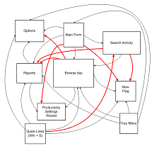
To try and understand the problem, I sat down today and drew a picture of the major forms in the application and how you can get from one to the other. The picture was too big to scan in, so I re-drew it in Visio. It ain't pretty:  
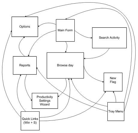
Then I added in lines for all the major new routes that people have been asking for:
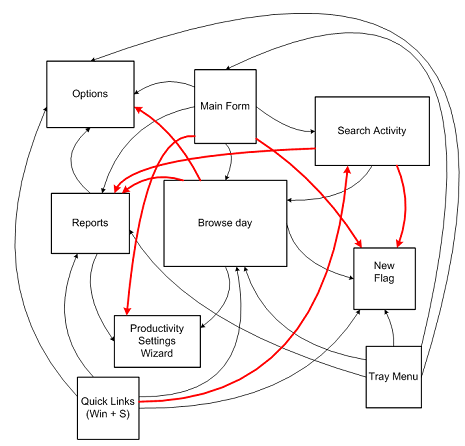
  And I immediately predicated where this was all headed: ![navigation in timesnapper the day after tomorrow [predicated]](http://secretGeek.net/image/flying_spaghetti_monster_a.jpg) So unless we're willing to let TimeSnapper turn into a pastafarian deity, its important we address this within one or two releases. I don't know what the best solution to this is, and we're open to ideas. If you've got any -- please share. One thought I've had is that we could include a context menu throughout the application, so that wherever you are you can right-click and get a 'goto' menu that gives you consistent choices. That way, without cluttering up the interface, we make every path possible. The downside to this is that it lacks discoverability. Another option is to include it as a menu at the top of each form. This would take up real-estate and sometimes seem inappropriate. We haven't considered including a ribbon-bar, or sticking a giant MS Outlook 97-style bar on every form, or turning it into an MDI style application. All up it's one of those simple yet thorny design issues that software development is filled with. So i thought i'd share it, and see what ideas were out there.
'Chad' on Tue, 11 Sep 2007 12:35:55 GMT, sez: One thing to consider would be implementing a search feature. I realize that search is *hard*, but you certainly have several keywords you could use for starters. You might want to get a few users to "beta test" this by collecting their search terms to better populate your keywords.
This isn't really my idea - I think I read it on Jensen Harris' blog when he was talking about Office improvements.
'matt' on Tue, 11 Sep 2007 12:43:59 GMT, sez: chad's right.. typing trumps pointing
http://www.codinghorror.com/blog/archives/000766.html
'Ryan Smith' on Tue, 11 Sep 2007 12:48:11 GMT, sez: I would think it would be nice to be able to get to any form from the main form. Then be able to get from any form back to the main form. This gives you at most two clicks to get to where ever you need to be. Plus you can create it without cluttering up every interface.
'engtech' on Tue, 11 Sep 2007 12:50:43 GMT, sez: I've been playing around with the idea of using off-the-shelf mind mapping software to explore maps of how to access functionality.
The idea is to get rid of multiple paths to access the same functionality (overall complicates user, testing) and to easily logically organize how things are accessed.
http://internetducttape.com/2007/08/31/mind-mapping-user-interface-complexity/
'ben' on Tue, 11 Sep 2007 16:37:44 GMT, sez: I second the search feature.
But, a context menu approach seems easier and could be just as effective.
I really don't like context menus though.
How about placing "Quick Links" menu on the top of every page, that only pops out when you click it. This would free space and allow for discoverability.
'Zooba' on Wed, 12 Sep 2007 04:58:48 GMT, sez: Go the ribbon.
Microsoft seems pretty easy on the licensing for it, it's more about making sure people get it right than making people pay money for it, and then you can blog about it for all us lazy people who won't play with it ourselves :)
'JB' on Wed, 12 Sep 2007 05:07:33 GMT, sez: Ok, this may sound a little backward to your post but about implementing a fully featured navigational system, but....maybe a step backwards first is in order??
"Pleasing some of the people all of the time and all of the people some of the time" or the 80/20 rule springs to mind.
Are all these navigational requests valid, or for instance are they coming from one very loud user :)
Doesn't help with your problem, i just though id chuck it into the mix for consideration, it may just save you hours of work.
'Chui Tey' on Thu, 13 Sep 2007 13:57:12 GMT, sez: How about a sitemap? (see my sig)
http://www.redmountainsw.com/wordpress/archives/should-a-desktop-application-have-a-sitemap
'MikeFitz' on Sat, 15 Sep 2007 06:01:13 GMT, sez: I've used Ryan Smith's technique a lot in the past. I.e., every form has a "go to menu" button (always in the same place) and the menu form is like a "home page" of hyperlinks to each function.
Another technique I've seen where a small footprint is important: A "Menu Button" which produces either a fly-out toolbar or a drop-down navigation side-bar. -- All the benefits of a context menu, plus it's easily discoverable.
|