TimeSnapper 3.1: Attack of the the Red/Green Stripes
There's a new release of TimeSnapper, which brings us up to version 3.1.
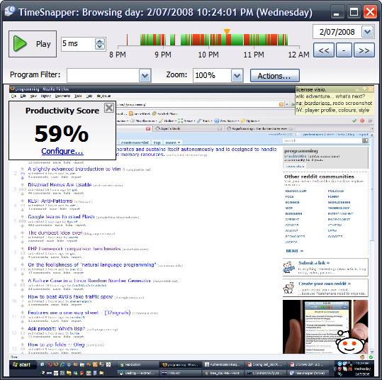
You can now see your productivity profile at a glance, when playing back your day.
This turned out to be a real "must have" feature. As soon as I'd implemented a rough version of it (on my home computer) I was frustrated that it wasn't yet available on my work computer. There was no going back.
We call it 'red/green' striping, because it shows productive time in green, and non-productive time in red.
You can quickly filter to see only the productive time, or only the non-productive time.
To teach TimeSnapper about what time is considered productive or non-productive you use a simple wizard. You list some applications as 'always productive'. And you can indicate keywords that are a sign of productive time.
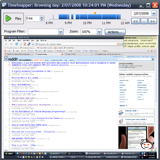
If you aren't interested in productivity tracking, then you get a smooth blue timebar instead.
It took a while to iron out the bugs, because this is a feature that I implemented, not Atli. To be fair, there were a lot of edge cases to uncover.
Also, automatic updates are enabled again. So you can automatically upgrade from whatever version you are on, right up to version 3.1.
Thanks to all the new users, and all the ongoing users who help us out with feedback and encouragement.
Also, please, if you see something we can do better, please tell us. We try. By god do we try!
Next → ← PreviousMy book "Choose Your First Product" is available now.
It gives you 4 easy steps to find and validate a humble product idea.