Google caught in a lie.
In the wake of the PRISM hacking scandal, we're all looking at the Big Cloud providers with a slightly more cynical eye than ever before.
So when I noticed a few pieces of intellectual dishonesty at Google Analytics I dug a little deeper than I normally would. And the deeper I dug, the worst things got. Hold on for a, well not a wild ride, more of a gentle somewhat nerdy ride, with a little trash-talking of Google+ along the way.
On the login page for Google analytics, they show you some enticing info-porn to get you excited before logging on.
Something fishy about this pie chart immediately caught my eye:
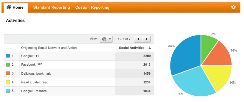
Look at the largest section of the pie, that blue section.
No way is that 34%! It's clearly just over 25% -- what kind of dumb mock up is this? Are they demonstrating their awesome analytic platform by showing us some faulty analysis?
But then I did a coffee spit.
The pie chart is suggesting that the two biggest contributors to your social traffic will be people 'plus-oneing' your content with Google+ (blue), and people re-sharing your content, with Google plus (light blue). In your dreams, Google! Your sad, sad, lonely, social-misfit dreams.
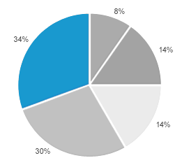
So, I crunched the numbers to see if the percentages of the labels had been tampered with, or the pie itself was altered. Here's the chart I produced, using the same raw numbers:
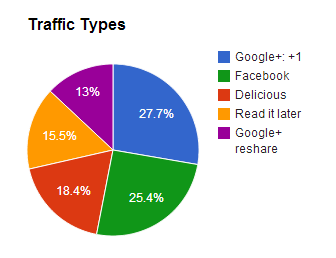
Some more bugs in their image. I'll do these quick fire in an ordered list:
- The table header says "1-7 of 7", when there are clearly only "5". Counting is hard, poor Google.
- Didn't 'Read it later' change its name to 'Pocket' about a million years ago in internet time?
- What is 'delicious'? Some ancient link-sharing site my grand-dad used on AOL from his fax machine?
- And are they incapable of recognising the possibility of traffic from twitter, or just incapable of saying the word?
So it's pretty obvious by now that the marketing image is very much a contrived image. But does it have any resemblance to the produce itself?
Here's a real pie chart from the dubious social network feature of Google Analytics: (I've removed my dismal figures)
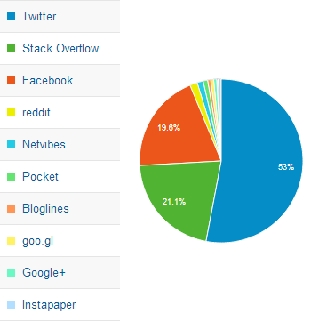
As I suspected, and unlike the mockup, the portions are laid out clock-wise, descending, starting at the top. And the percentage's are drawn inside the pie, not outside of it.
And this time you can tell you're looking at a real Google Analytics pie chart, because Google+ contributes less than 1% of the social traffic.
Next → ← PreviousMy book "Choose Your First Product" is available now.
It gives you 4 easy steps to find and validate a humble product idea.